Totally judging books by their cover.
Hey, you wrote that book, you slapped on a shitty book cover and expect me to think your book could wow me? What the fuck is wrong with you?
Of course I judge you by your book cover. I judge the quality of your writing, and more importantly, your taste – or should I say, your total lack of taste when you allowed such a laughable image to represent your written work. Your choice of picking a bad cover tells me all I need to know about how horrible you probably are as a writer.
So, like, no. These books are just to laugh at, I am not even reading the sample chapter.
In no particular order:

Really? The runner (On your marks, get set, go!) on a deserted road, out of focus, with the wolf in moon, and the terrible fonts? Really???

Ever heard of “less is more”?

Savior? Laughing my head off here. Even the model looks like he’s thinking, “huh”?

Are you blind? Can’t you see the proportions are stretched wrongly?

A woman of heart with this cover? A blank white sheet as background could still trump this.
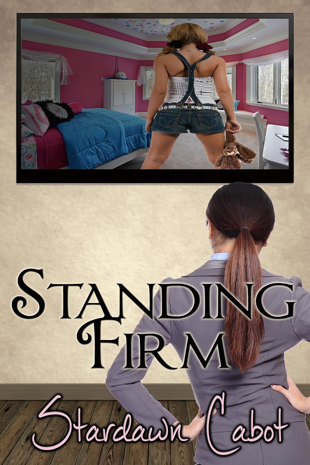
Two photos of two women (one of them stretched into wrong proportions again) “standing firm”… you really are just trying to make me laugh, right?

Seriously this “author” has possibly never even read an ebook before. A horizontal cover??? And what, did you “design” this on Powerpoint?
Time and money are both precious to readers.
Stop raping my eyes with these atrocities as book covers.

Hey Abby, thanks for following my blog. The concept of snarly female is certainly fun and I look forward to reading more. (your tweets are quite cleaver as well)
I’m being myself here. Being snarly isn’t just a concept, but thanks.
That last one is terrible, even for PowerPoint.
Yup.
HAHAHAHAHAHA!!!! The stroke of lightening is my personal favorite. Oh jeez these suck. Great post!!
Thanks! 😉
Funny stuff.
Thanks!
Nice choices. I bet you could find thousands more though.
yeah sure.
When I was looking to buy a cover for my book I saw websites offering covers very similar to these for hundreds of dollars. I’m hoping these authors took the cheap option and created them themselves.
not the point. self-designed or paid, these are junk. reflects poorly on the author’s taste.
Agreed, I was just hoping for their sakes that they hadn’t paid money for them.
Hilarious!
thanks.
You know you will be reading a text that has not been edited or proofread when you see a cover like these. Automatic FAIL.
ya.
This made me laugh, thanks for following!
you’re welcome.
thanks for liking my blog – I can see your point of view, although one of my favourite reads doesnt have the greatest of covers. 😉
I do think Indie authors need to really research Cover designers – there are great ones out there and they start at reasonable prices.
there’s a difference between “not an artwork” kind of book cover and just plain junk.
Reblogged this on katsindiebookblog
Those are some crappy-ass covers! Who makes this crap? Obviously they don’t have eyes or hands! TiV
Wow. And I thought my cover was bad.
Found my way here from KatsIndieBookBlog and I think I might hang around for a while, love a bit of a snarly read 😀
Thanks!
I am loving the attitude in your writing and reviews, so sassy! Makes for a great read.
Thank you Jennie!
This made me laugh. I like your wit and humour!
Also, thanks for the follow!
Thanks!
Hahaha, great read. I’d sooner read something with clip art on it than these. At least then I might think that they really put no effort into a cover and all their effort into writing something decent. These all give me the impression that they “tried” to have a good book cover, just like they probably “tried” to write a book.
Wow haha ,those are pretty…..great. Where did you find these? I like the lightning effect in the last one, gives it an edge… or a edge off a cliff? !
This post has made my day. The horizontal cover was a revelation.
Thanks.
Your writing style is hilarious, I have to admit those are really bad covers their publicists should find new jobs.
Thanks!